
One of the most powerful and user-friendly item types in Oracle APEX is the Popup LOV (List of Values).
Developers love it because it provides a clean UI, and users love it because it supports powerful search capabilities across multiple columns (introduced in APEX 19.2).
Popup LOV supports:
✅ Single value selection
✅ Multiple value selection
✅ Inline popup display
✅ Modal dialog display
✅ Multi-column search capability
By default:
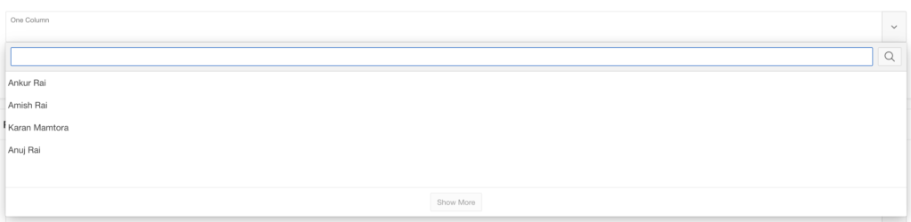
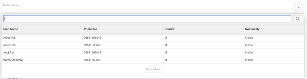
- If the LOV query returns one column, APEX displays the values as a list.
- If the LOV query returns multiple columns, APEX displays the results in a grid layout.
But what if you want more control over how the results appear?
For example:
- Show employee details in multiple lines
- Add avatars
- Create card layouts
- Improve the overall user experience
Let’s explore how to customize Popup LOV using JavaScript templates and CSS.
👨💻 Creating a Multi-Column Popup LOV
In this example, we will display Employee details.
First, create a List of Values in Shared Components.
LOV Query
SELECT *
FROM EMPLOYEES
Next:
- Create a new Page Item
- Select Popup LOV as the item type
- Choose the LOV under List of Values
By default, APEX will display the LOV as a grid layout if multiple columns exist.
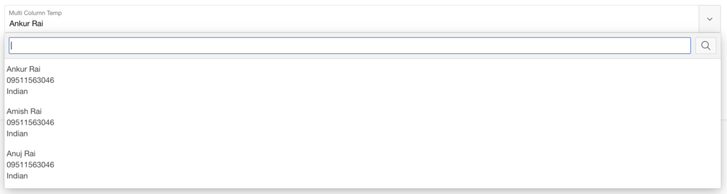
But what if we want to display the information in 3 separate lines per record?
⚙️ Defining a Custom Popup LOV Template
To customize how the LOV records appear, use the JavaScript Initialization Code property.
This allows you to modify the options object during Popup LOV initialization.
JavaScript Initialization Code
function(options) {
    options.display = "list";

    options.recordTemplate = (
  '<li data-id="~EMP_NAME.">' +
     '<div class="content">' +
         ' <span class="name">~EMP_NAME.</span>' +
         ' <span class="number">~PHONE_NO.</span>' +
         ' <span class="nationality">~NATIONALITY.</span>' +
     '</div>'+
  '</li>').replace(/~/g, "&");

    return options;
}
This template tells APEX to render each record as a custom list element with employee details.
🎨 Improving Layout Using CSS
To display the data in three lines, apply a simple Flexbox CSS rule.
CSS Code
.content {
      display: flex;
      flex-direction: column;
}
Now the Popup LOV will show:
instead of a single row.
🚀 Advanced Popup LOV Examples
Once you start customizing Popup LOV templates, the possibilities become endless.
Let’s look at two advanced UI examples:
1️⃣ Simple User List with Avatars
2️⃣ Card Layout with Icons and User Details
📊 Data Source
For both examples, we will use the following query.
SELECT
    EMP_NAME,
    NVL(apex_web_service.blob2clobbase64(EMP_IMAGE), EMPTY_CLOB()) AS EMP_PICTURE_BASE64
FROM EMPLOYEES
This query converts employee images into Base64 format so they can be displayed in the UI.
👤 Simple List with Avatars
This example displays employees with profile pictures and names.
JavaScript Initialization Code
function(options) {
    options.display = "list";

    options.recordTemplate =
        '<li data-id="~EMP_NAME.">' +
            '<div style="display:flex;align-items:center;gap:12px;padding:8px;">' +

                '<img src="data:image/jpeg;base64,~EMP_PICTURE_BASE64!RAW." ' +
                'style="width:50px;height:50px;border-radius:50%;object-fit:cover;" ' +
                'onerror="this.src=\'#APP_FILES#default_avatar.png.webp\';">' +

                '<div>' +
                    '<span style="font-weight:600;font-size:14px;">~EMP_NAME.</span>' +
                '</div>' +
            '</div>' +
        '</li>';

    options.recordTemplate = options.recordTemplate.replace(/~/g, "&");

    return options;
}
Result:
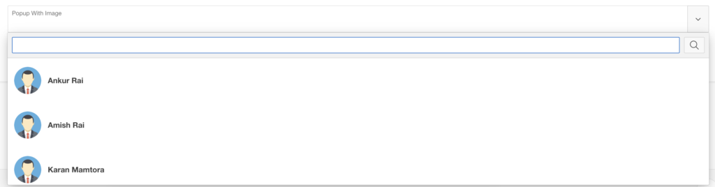
This layout provides a clean and modern user list.
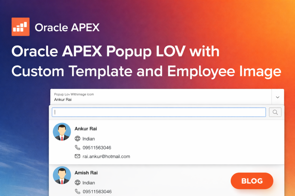
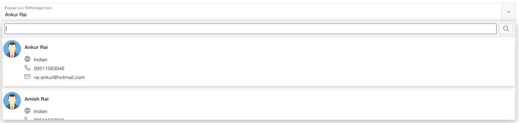
🃏 Cards Layout with Avatars and Icons
This example creates a card-style interface displaying detailed employee information.
JavaScript Initialization Code
function(options) {

    options.display = "list";

    options.recordTemplate = (
        '<li data-id="~EMP_NAME.">'+
            '<div class="card">' +
                '<img src="data:image/jpeg;base64,~EMP_PICTURE_BASE64!RAW." ' +
                'style="width:50px;height:50px;border-radius:50%;object-fit:cover;" ' +
                'onerror="this.src=\'#APP_FILES#default_avatar.png.webp\';">' +

                 '<div class="user-infos-card">' +
                     '<span class="user-name-card"><b>~EMP_NAME.</b></span>' +

                     '<span class="user-info-card">' +
                         '<span class="fa fa-globe user-info-card-icon"></span>'+
                         '<span class="user-info-value">~NATIONALITY.</span>'+
                     '</span>' +

                     '<span class="user-info-card">' +
                         '<span class="fa fa-phone user-info-card-icon"></span>'+
                         '<span class="user-info-value">~PHONE_NO.</span>'+
                     '</span>' +

                     '<span class="user-info-card">'+
                         '<span class="fa fa-envelope-o user-info-card-icon"></span>'+
                         '<span class="user-info-value">~PERSONAL_EMAIL.</span>'+
                     '</span>' +

                 '</div>'+
            '</div>'+
        '</li>').replace(/~/g, "&");

    return options;
}
🎨 CSS Styling for Card Layout
.card {
    box-shadow: 0 4px 8px rgba(0,0,0,0.2);
    transition: 0.3s;
    display: flex;
}

.card:hover {
    box-shadow: 0 8px 16px rgba(0,0,0,0.2);
}

.user-infos-card {
  display: flex;
  flex-direction: column;
  margin: 1rem;
}

.user-name-card {
  margin-bottom: 1rem;
}

.user-info-card {
  margin-bottom: 0.5rem;
}

.user-info-card-icon {
  margin-right: 1rem;
}
This creates a modern card-based Popup LOV layout with icons and structured information.
💡 What’s Next?
Once you start customizing Popup LOV templates, you can build:
✔ User pickers with profile photos
✔ Product selectors with images
✔ Card-based customer lists
✔ Rich employee directories
✔ Beautiful UI components inside LOVs
At this point, your imagination is the only limit.
Popup LOV is one of the most flexible components in Oracle APEX UI customization.
🏁 Conclusion
Customizing Popup LOV templates allows you to significantly enhance the user experience of Oracle APEX applications.
By combining:
- JavaScript templates
- CSS styling
- APEX metadata
You can transform a basic LOV into a rich interactive component.
Hi, I’m Ankur Rai, an Oracle APEX Developer with 6+ years of professional experience in building enterprise applications. I specialize in creating scalable and efficient solutions using Oracle APEX, PL/SQL, and SQL to solve real-world business challenges.
I am a 3X Oracle APEX Professional Certified Developer and also an Oracle ACE Associate Member, actively contributing to the Oracle community by sharing knowledge, insights, and best practices. Through my blogs, I aim to help developers learn, grow, and build better Oracle APEX applications together.